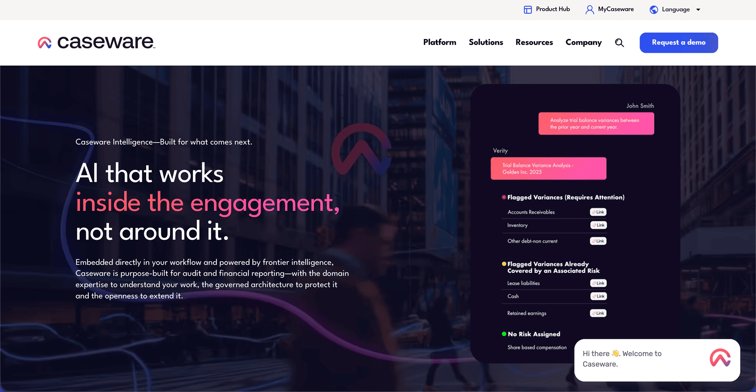
When people talk about “design flex,” they usually mean bold typography, slick animations, or some micro-interaction magic.
But the real flex? Building something that works beautifully — for everyone.
Accessibility isn’t a limitation. It’s proof of mastery. Because when your design is inclusive, clear, and resilient, it means you’ve nailed the fundamentals.
1. Inclusion Is Power
Great design removes barriers. It lets everyone — regardless of ability, device, or circumstance — engage with your content.
Accessible sites serve people with disabilities and people with distractions, slow internet, aging eyes, or one hand on a phone while holding coffee.
2. It’s Just Good UX
Accessibility forces clarity: clean structure, strong contrast, logical flow, and readable type.
Those same principles make a site easier for everyone to navigate. If your site is usable without sight, sound, or a mouse — it’s probably just flat-out better.
3. It Future-Proofs Everything
Accessibility-first sites are built on solid, semantic foundations.
They survive redesigns, new devices, and new tech.
While others are retrofitting buttons with alt text later, your site just keeps working — fast, flexible, and compliant.
4. It Builds Brand Credibility
An accessible site says something about your values. It tells people your brand prioritizes clarity, empathy, and excellence over aesthetics alone. That earns trust — from clients, users, and future talent.
5. It’s the Ultimate Skill Test
Anyone can make a beautiful layout. Only great designers can make one that’s beautiful, accessible, and performs flawlessly across every screen and situation. That’s not compromise — that’s craftsmanship.
The Real Flex
Accessibility isn’t about checking boxes. It’s about building things that endure — experiences that work for people and machines alike.
If you can make a site everyone can use — fast, intuitive, and inclusive — you’ve already out-designed 90% of the web.
And when AI agents start “browsing” for us, your site will still be ready.