Services: Brand Strategy · UI/UX Design · Webflow Development · Content Strategy · SEO Migration · CMS Architecture · Third-Party Integrations
Stan, better known to his audience as Stan The Annuity Man®, built his business on saying the thing the rest of the annuity industry won't: most of what's sold in this space is garbage, and he'll tell you exactly which products are worth your money and which aren't. It's a "will do, not might do" philosophy, delivered with the confidence of a rock star who's already sold out the show: no hedging, no sales spin, just what three decades in the business tells him is actually right for you.
The problem was that his website didn't sound like him at all.
Stan is America's Annuity Agent®, the top independent annuity agent in the U.S. and, by his own count, the top annuity YouTube expert on the planet. He's published seven annuity books (an eighth, The Annuity Stanifesto II, is on the way), put out more than 2,000 educational videos, and built a support team that's licensed in all 50 states and Puerto Rico and paid salary, not commission. He is, by any fair measure, a genuine thought leader and pioneer in direct-to-consumer annuities. But their previous site looked like every other financial services template. Soft blues, stock-photo warmth, a homepage that introduced Stan instead of confronting you with him. For an audience that had already watched several of his videos before ever landing on the site, that mismatch was hard to miss.
8020 was brought in to fix that. Not with a refresh, but with a full rebrand, an improved information architecture, and a ground-up Webflow build designed around one goal: turn a site full of engaged, high-intent visitors into a site that gets them on the phone with Stan.
The Challenge: A Warm Audience Hitting a Cold Wall
Before any design work started, we pulled GA4 analytics and ran Hotjar heatmaps and session recordings across the existing site to find out exactly where that funnel was breaking. What we found reframed the entire project.
Visitors weren't spending much time on the homepage, barely enough to scroll past the hero. The calculators, the most-used feature on the site by far, weren't converting as expected: session recording after session recording showed the same pattern, someone filling out a full calculator form, seeing their results, and leaving without clicking anything. The one path that did convert was going straight from the homepage to Book a Call, and it converted far better than everything else on the site combined.
Stan's close rate on the phone was excellent. The problem was never the sales process. It was everything upstream of it. The brief became clear: build a site that gets more of that warm, parasocial, already-convinced audience onto the phone with Stan, and get out of their way everywhere else.
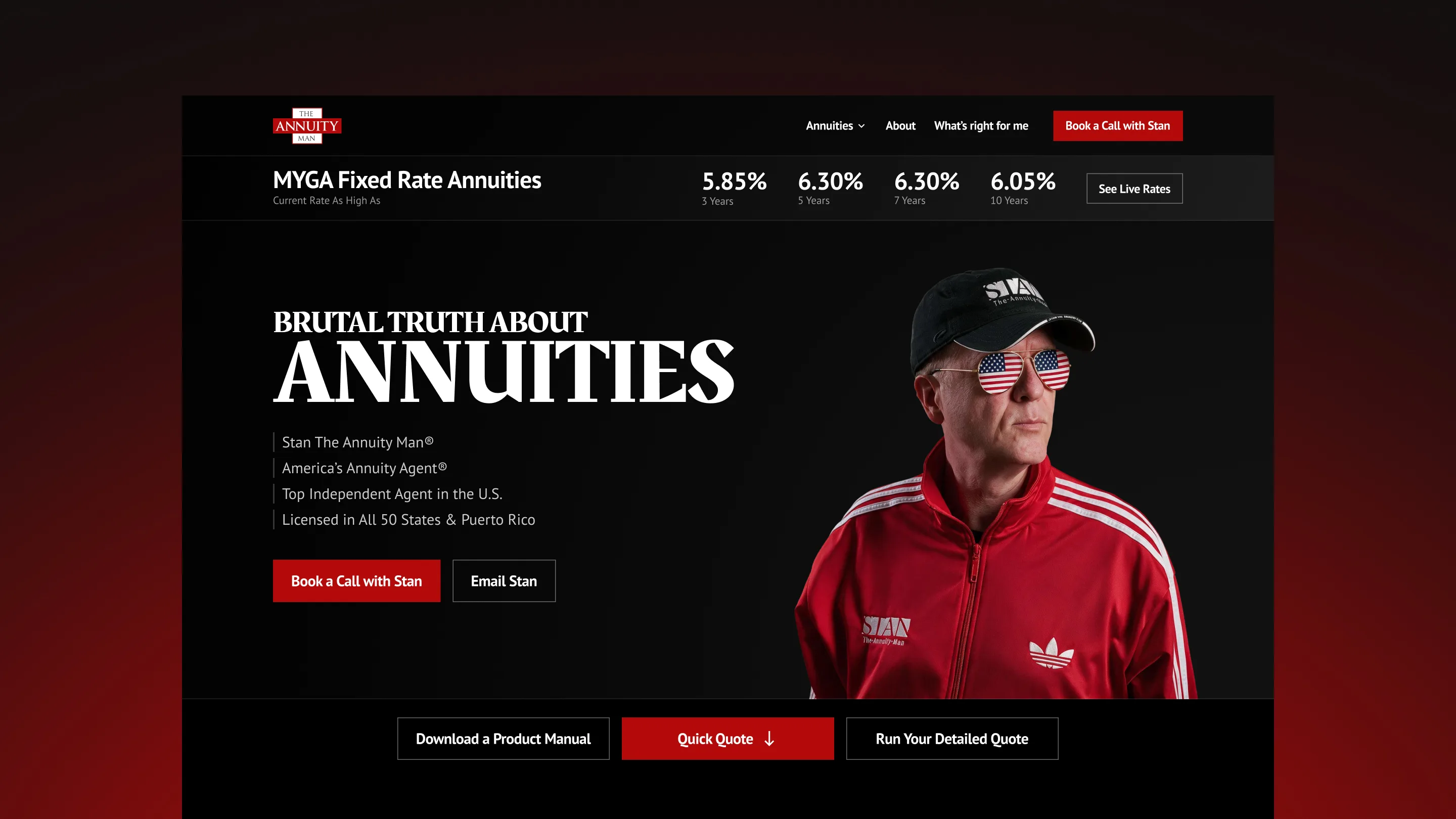
There was also a visual identity problem sitting on top of the funnel problem. Stan's on-camera persona is confrontational and proudly polarizing. He's the rock star of the annuity world, and the brand needed to look the part instead of hiding it behind a soft, corporate palette that actively undersold him.
Discovery and Strategy: Letting the Data Write the Sitemap
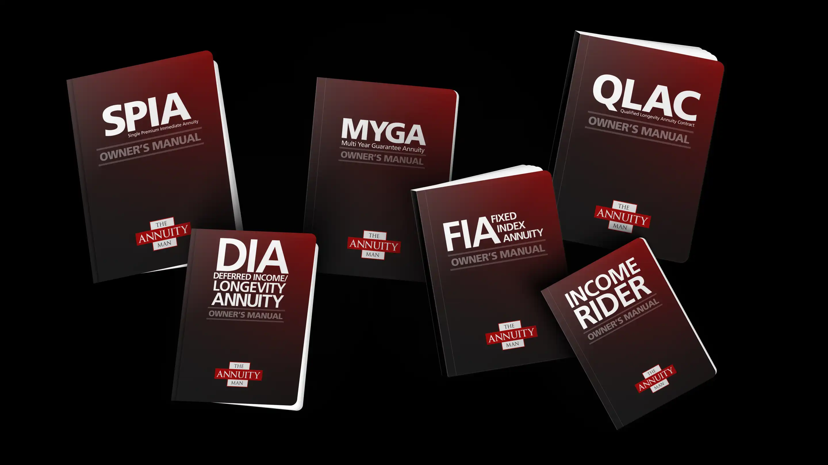
Rather than starting from a moodboard, we started from the funnel data. Every decision in the new sitemap ties back to a specific finding from the Hotjar and GA4 research, not stylistic preference. Homepage engagement told us the entire structure needed to become a conversion page rather than an "about us" page: hero, live rate ticker, guided questionnaire, Book a Call, in that order, with everything below the fold treated as secondary. Click-map data showing the MYGA rate ticker and "Get a Quote" as the two dominant interaction zones told us both needed to live in the hero, not behind a nav click. And the pattern of visitors completing a calculator and abandoning at the results screen told us the site needed a dedicated post-quote bridge: a moment engineered specifically to convert.
That bridge became the Quick Quote, a five-product, no-email, no-name preview tool that gives a visitor a ballpark rate in seconds and funnels every outcome to one place: Book a Call with Stan. It's a deliberately contrarian piece of UX for an industry built on gated forms, and it exists because the data showed exactly where the old funnel died.
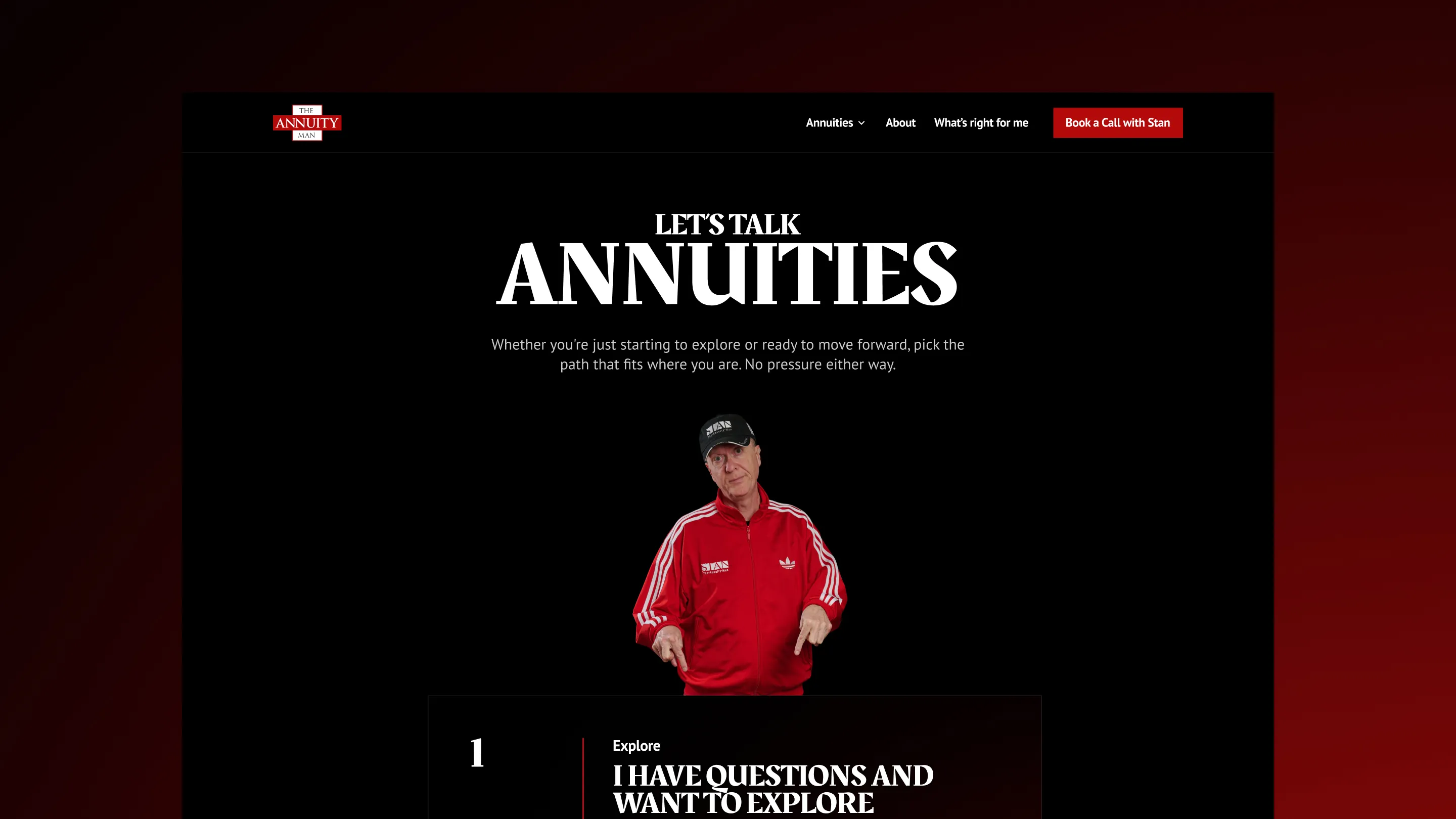
Content strategy ran in parallel. We ran a full Screaming Frog crawl against roughly 1,500 existing URLs, built an Airtable migration map as the single source of truth, and worked through a Keep / Kill / Combine review with the client to fold duplicate /learn/ slugs, retire dead campaign pages, and consolidate a sprawling, ungoverned content library into The Annuity Man University, a single hub filterable by format (video, article, podcast, book, media appearance) and by topic, from product-specific clusters like SPIA and MYGA to broader ones like Retirement Income and About Annuities. The SEO audit that came out of this phase gave the sitemap work a second job: alongside organizing pages for people, the new architecture needed to clean up the structural issues that were holding the site back in search
From Corporate Blue to Rock and Roll: Designing a Character-First Brand
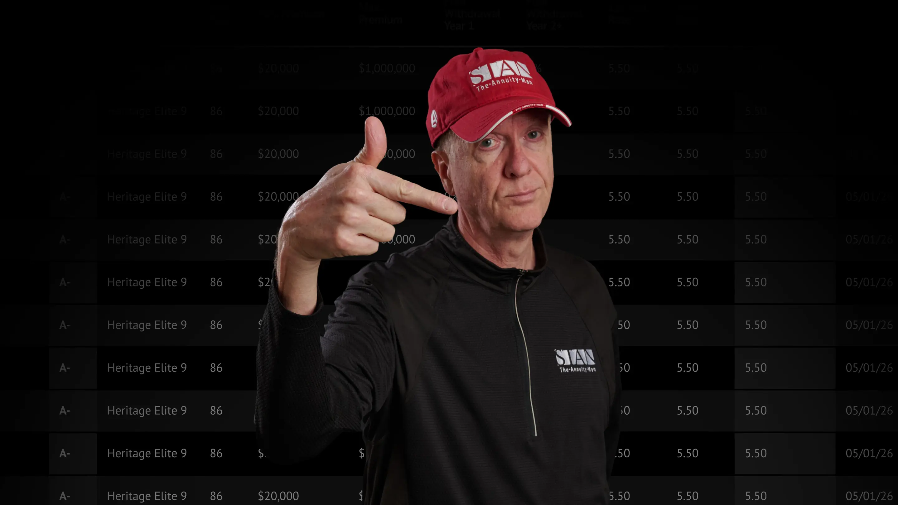
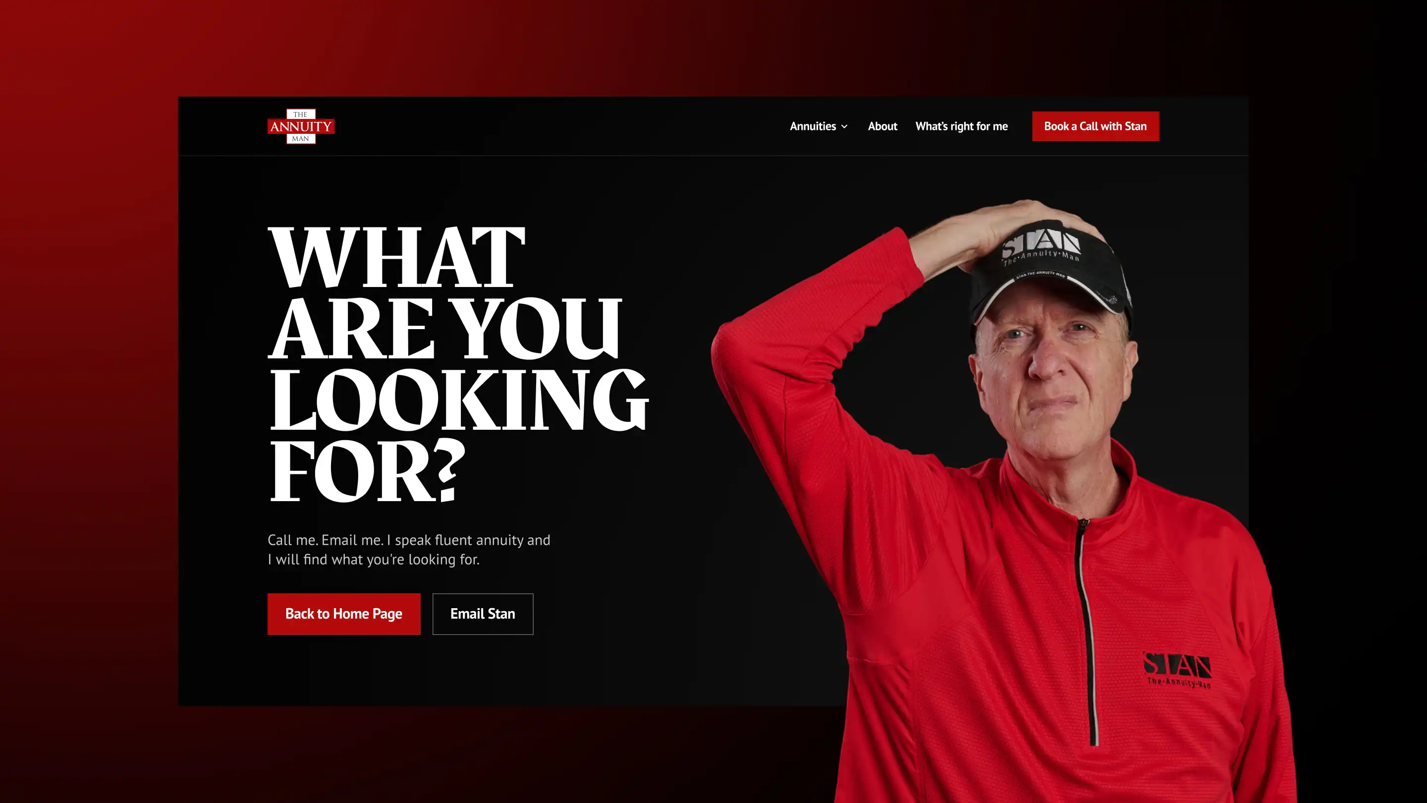
The creative direction took its cues directly from Stan rather than from the annuity category. Reference sites weren't other financial advisors. They were ozzy.com, Motörhead's site, Liquid Death, and Huberman Lab: brands built around one unmistakable, unapologetic personality, where the person is the product and the audience shows up for them specifically. That's the model the design leaned into: Stan isn't a spokesperson bolted onto the site, he's on nearly every page, in the hero, in the video library, in the CTA sections, deliberately built to feel less like a financial services homepage and more like stepping into his world. The new palette dropped the light, airy blues entirely in favor of black with a restrained red accent throughout. Typography moved to Rakkas, edgy enough to read as a departure from the rest of the industry, legible enough to work for an audience that skews 50 and older. A new photo shoot put Stan in a red tracksuit, red cap, and red-tinted sunglasses, deliberately unsmiling. The brief was closer to prestige-drama key art than headshot photography, and every trace of stock-photo clip art, globes, and dollar signs got cut.
None of it was decoration for its own sake. The brand brief was explicit: this had to look like the "walking middle finger of annuity truth." If you love Stan, you're home. If you don't, this isn't the site for you. That kind of cult-following intimacy is a genuinely unusual thing to build a financial services site around, and it's exactly what makes the new site feel instantly recognizable as him instead of a template with his name on it.
Migration and Development: A Webflow Build Made to Scale With Stan
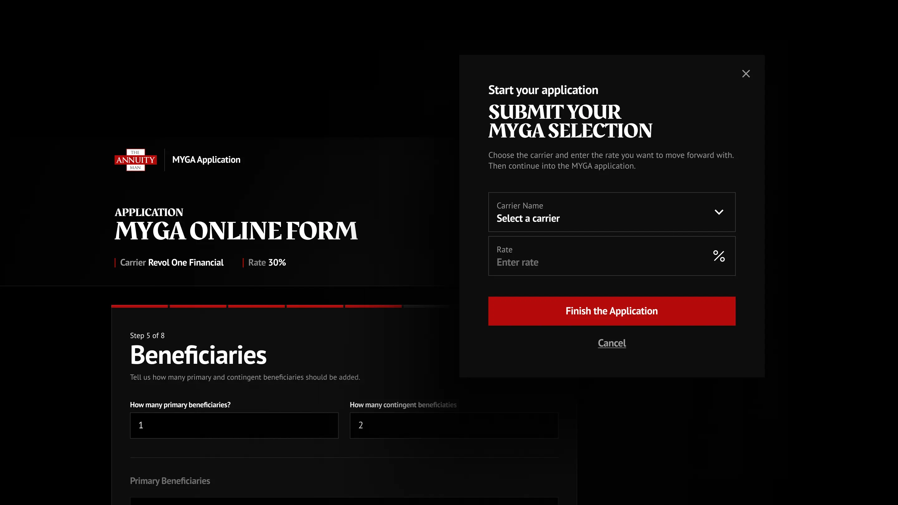
Bringing the redesign to life meant rebuilding the site natively in Webflow using variables and reusable components across static pages, listing pages, and CMS collections, all sharing consistent typography, spacing, and interaction patterns so the team could extend the system without reinventing it page by page. The client's five product calculators, previously locked inside a former vendor's proprietary code, were migrated to infrastructure the client fully owns and controls. Quick Quote, the no-gate preview tool that bridges a quote to a booked call, was built new. The booking flow kept its existing scheduler, restyled end-to-end to match the new brand rather than sitting on the page as an off-the-shelf widget.
The build that took the most creative and technical thought was one that didn't exist on the old site at all. Stan posts a new YouTube video almost every day, seven days a week, but that entire library lived off-site, nowhere on stantheannuityman.com. This project brought it home for the first time: a dedicated Video Series collection built to house it. We built an automated sync that pulls new uploads directly into a dedicated Video Series collection the moment they're published, no manual entry required. Then we went a step further. Because YouTube blocks transcript scraping at the server level, we integrated a transcript API to backfill full transcripts and timestamps across the archive and attach them automatically to every new video going forward. That decision makes Stan's daily video output indexable for the first time, giving content he was already creating anyway a real shot at showing up in search.
On top of the core build, we layered in GA4, Google Ads, and Meta tracking through Google Tag Manager, all gated behind a custom consent management system built to meet the latest state privacy regulations. Then the whole site went through a cross-browser and cross-device QA pass before launch.
The Outcome
The Annuity Man went from kickoff to launch in about 12 weeks. Within days of going live, the client reported back: 'Unique visits, data transfer, API usage, time on site, and pages per visit are all meaningfully up.'
The GA4 data since launch backs this up:
- Total users up 22% and pageviews up over 30% in the six weeks since launch.
- Time spent engaged per session up 31%, people are sticking around longer, not just passing through.
- Form starts up over 250%, more visitors are actually beginning to take action.
Since launch, the numbers back up what the team felt in the first week:
- A new quote-to-call bridge, live for the first time. The Quick Quote tool, built from scratch during this project, gives visitors a no-email, no-name ballpark rate across all five product types and funnels every outcome straight to Book a Call with Stan.
- CMS collection items up 57%, driven largely by the automated YouTube sync pulling in Stan's video library, transcripts included, without a single manual entry.
- Pages up 25%, reorganized into cleaner, SEO-driven topic clusters.
- Redirects more than tripled, carefully mapped through the Airtable migration process to preserve accumulated SEO equity from the old URL structure through the new one.
Just as importantly, the site now looks and sounds like the person selling on it. The rebrand didn't soften Stan to fit a category. It built a category-breaking site around him, and gave his highest-converting asset, the direct line to a phone call, a real chance to do its job.
Want a site that finally sounds like the person running it? Talk to 8020 about your brand and Webflow build.
%20(1).jpg)