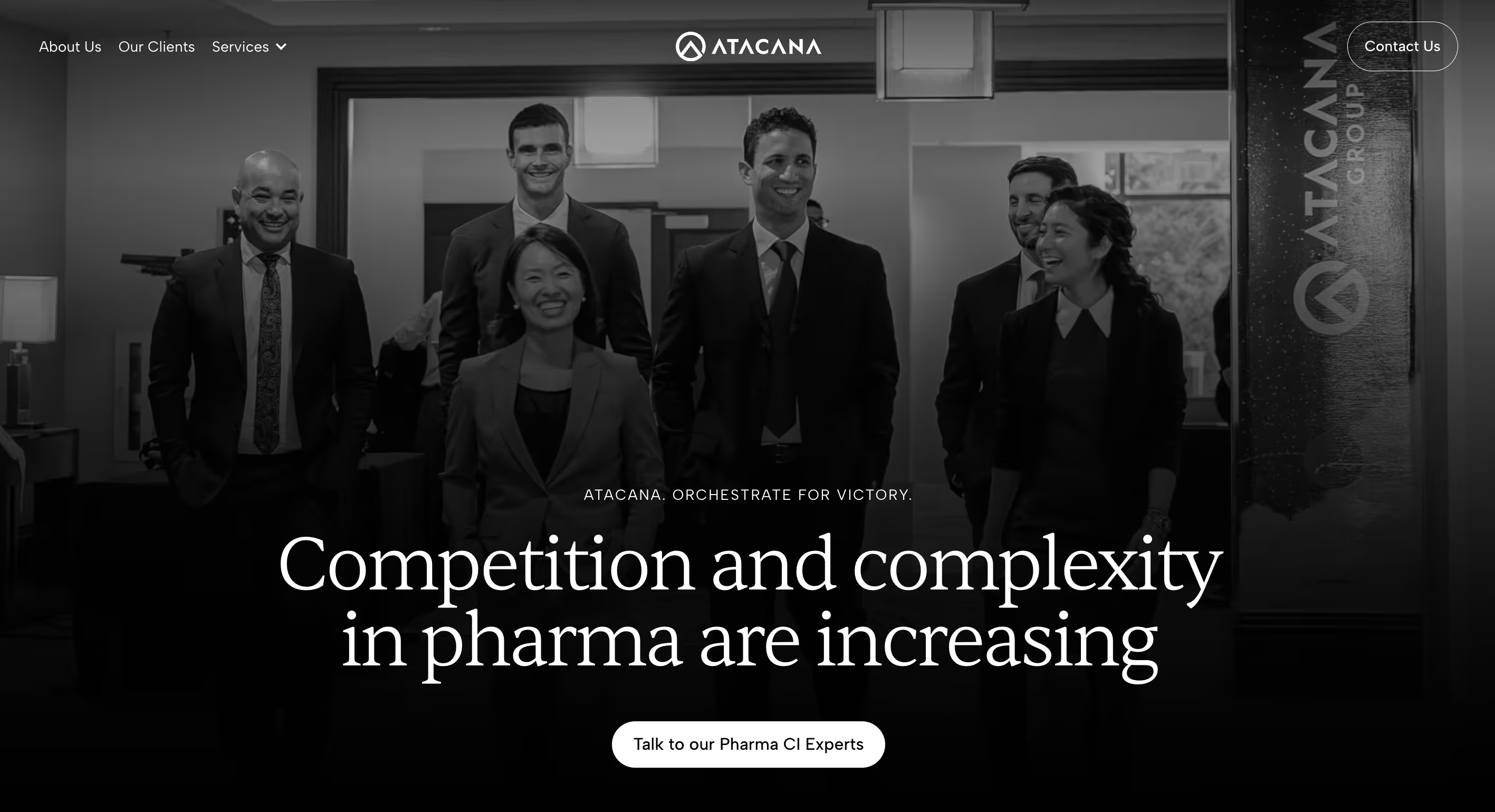
About The Client
Atacana is a specialized pharmaceutical strategy firm founded by former pharma executives who spent their careers inside the world's largest pharmaceutical companies before launching their own practice. Their work sits at the intersection of market intelligence and commercial strategy, helping global pharma teams bring blockbuster products to market with greater clarity, speed, and competitive confidence.
Atacana works exclusively with global pharmaceutical companies: the kind managing blockbuster products with billion-dollar revenue potential. Their engagements range from pre-launch competitive strategy to lifecycle management, supporting the senior leaders who make the highest-stakes commercial decisions in the industry.
With two core service offerings: Atacana CI (competitive intelligence) and Atacana Competitive Readiness (strategic advisory, workshops, and launch preparation), the firm had built a strong reputation through referrals, conference presence, and LinkedIn. What they lacked was a website that reflected it.
The Challenge
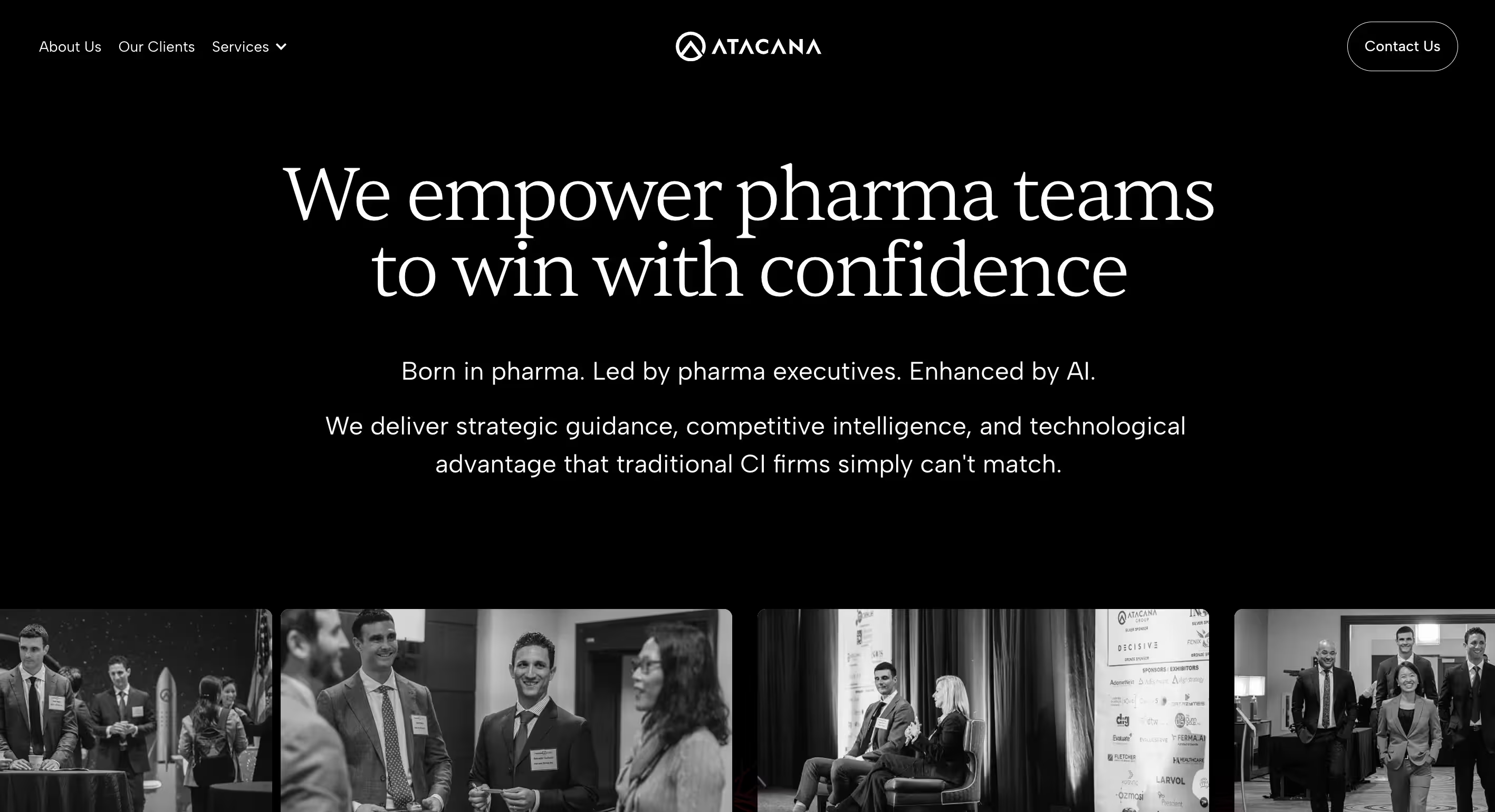
When Atacana first came to 8020, they were running on a WordPress site that had grown organically over the years, but dense with content, inconsistent in messaging, and disconnected in structure. The pages didn't flow. Sections contradicted each other. The visual design didn't project the premium, senior-level credibility that Atacana's positioning required.
The problem wasn't a lack of substance. Atacana had deep expertise, a compelling origin story, and a differentiated offering. The problem was that none of it was coming through.
There was a deeper strategic challenge too. Atacana's target audience consists of brand leads, insights directors, and senior commercial executives at top pharma companies who don't find vendors through Google. They arrive via referral, LinkedIn, or a conference introduction. When they land on the site, they're not exploring, they're validating. They need to see themselves in the language, feel the credibility in the design, and find a clear next step.
That meant the site needed to do something harder than rank well or look polished. It needed to convert an already-informed, already-skeptical decision-maker into someone willing to book a call.
Adding to the complexity: Atacana had an existing WordPress site with real SEO equity and live service pages they couldn't simply take down. Any new build would need to coexist with what was already there until the full site was ready.
Strategy: Think Before You Build
Before touching a single design file, 8020 invested heavily in understanding Atacana's business, their clients, and what the site needed to actually do.
Website Strategy & Positioning
8020 developed a comprehensive content and messaging strategy grounded in what Atacana's audience actually needs when they arrive on the site: validation, clarity, and proof. The strategy defined the site's role precisely. Not a brochure, not a lead-generation machine, but a conversion bridge between a warm referral and a capabilities call.
Four messaging pillars were established to guide everything from headlines to microcopy:
- Built by Pharma, for Pharma: credibility through lived experience, not just industry knowledge
- Strategic Intelligence, Not Data Dumps: framing the service as decision-ready, not merely informative
- AI-Enhanced Speed and Foresight: proprietary technology as a differentiator, not a buzzword
- True Strategic Partnership: a long-term, embedded relationship model, not a vendor transaction

Content Architecture & Sitemap
Working from the WordPress site audit and a series of stakeholder sessions, 8020 defined a clean information architecture for the full site. The approved sitemap included:
- Homepage — the primary conversion page, designed as a strategic sales narrative
- About Us — company story, values, leadership, sustainability, and careers
- Our Clients — audience-specific messaging for Commercial, CI, and Senior Leadership teams, plus therapeutic area expertise and a full product lifecycle matrix
- Services — dedicated pages for Competitive Intelligence and Competitive Readiness
- Team — individual bio pages powered by a Webflow CMS
- Supporting pages — Privacy Policy, 404, Thank You
The architecture was designed to serve two audiences simultaneously: the decision-maker validating a referral, and the internal stakeholder building the case for engagement.
Phase 1 First: Homepage as Proof of Concept
Rather than waiting for the full site to be complete, 8020 and Atacana agreed on a phased approach. Phase 1 would deliver a single, high-converting homepage live in Webflow, sitting in front of the existing WordPress site via a technical subdomain setup. This gave Atacana a modern, credible front door immediately, while the rest of the site was being designed and built. It also gave both teams a concrete deliverable to align on before committing to the full scope.
Design: Premium, Human, and Unmistakably Pharma
Moodboards & Visual Direction
Atacana had worked with a previous agency on brand identity, a foundation that included a deep red, black, and gray palette. The results were mixed and the client wasn't fully satisfied with the direction. 8020 had creative latitude to expand and refine.
Three distinct moodboards were developed, each exploring a different dimension of Atacana's positioning:
- Confident and Familiar — anchored in Atacana's existing deep red, elevated with new typography, gradients, and texture
- Clean, Modern, Trust-Driven — cool blues and white space, clinical and forward-facing
- Human, Growth-Focused, Tech Edge — deep greens and dark backgrounds, innovation-forward
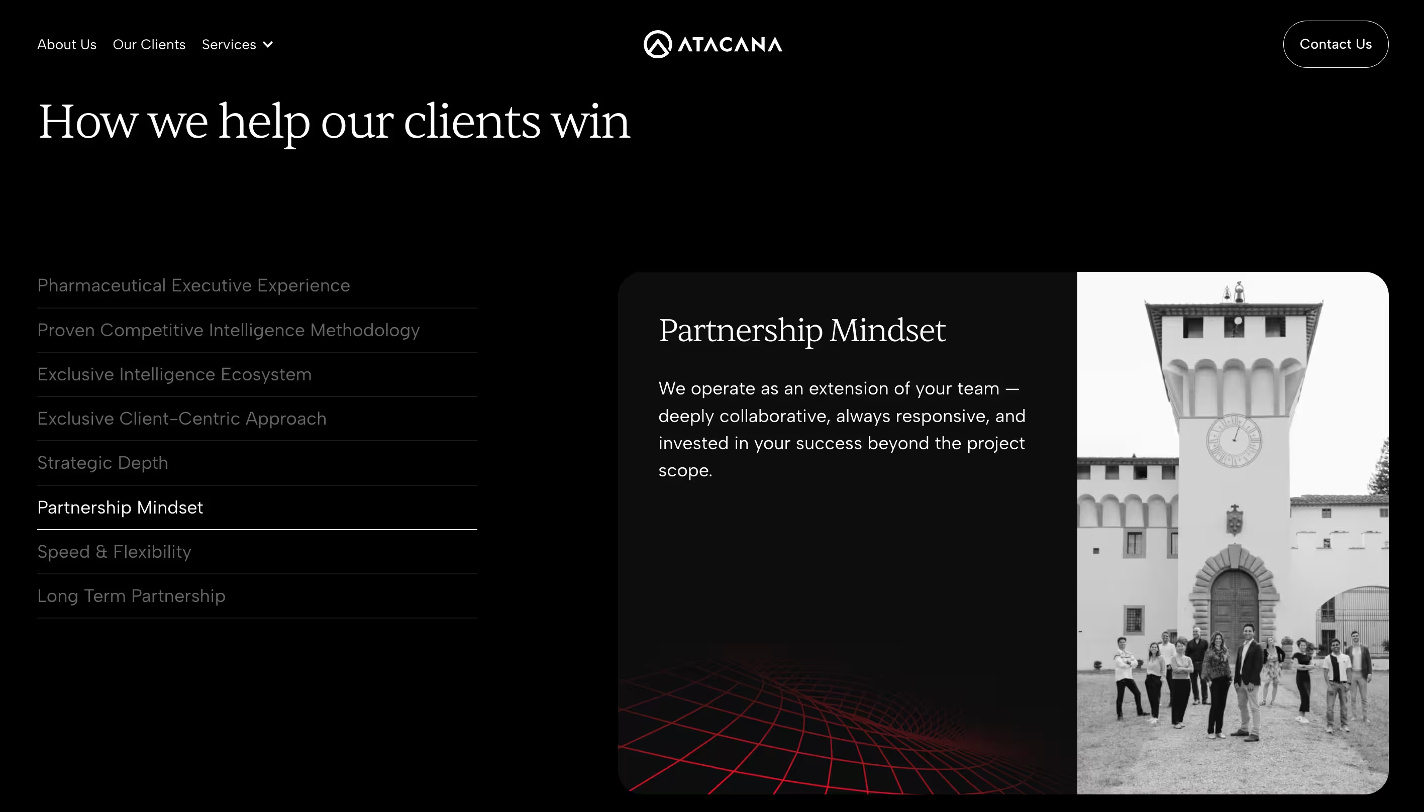
The client's feedback was clear and decisive: keep the deep red. Atacana red, not Ferrari red. Think Cartier. The brand should feel luxurious without shouting, premium without being sterile. And critically, it needed to feel human. The previous agency had failed to incorporate the real people behind Atacana, which was one of the founder's most important requirements.
"90% of the pictures on our website are real people who work at Atacana... we're a professional service firm and people work with people. That has to come across."
Design
Two homepage concepts were developed, exploring different executions of the approved direction: one clean and minimal with deep red as the primary accent, the other bold and dark with subtle texture for a more premium feel. After client review and iteration, the final direction combined the elegance of the dark approach with the structural clarity of the lighter one. The result is a homepage that looks like it belongs in the boardroom of a global pharmaceutical company.
That visual system was then extended across the full site. Each page was carefully structured to serve its purpose: the Our Clients page uses audience cards and a product lifecycle matrix, the About Us page leads with the company origin story and real team photography, and the service pages follow a consistent narrative arc from problem through methodology to proof. Custom icons were created for the service pillars, adding brand personality throughout.
Development: Built to Last in Webflow
Phased Build on an Existing Webflow Project
Because Phase 1 had already established a Webflow project with the homepage live, Phase 2 development required building the full site on top of that existing foundation, preserving what was already published, extending the design system, and ensuring consistency across every new page.
CMS Architecture
The site's CMS was structured to give Atacana's team maximum flexibility for ongoing content management:
- Team Members collection — powering individual bio pages with dynamic fields for role, credentials, therapeutic area focus, LinkedIn, and long-form bio
- Page-level editable content — allowing key sections to be updated without touching Webflow's designer
Post-launch, the 8020 team recorded a full suite of Webflow training videos, consisting of nine modules covering everything from getting started to managing CMS collections to creating new static pages, ensuring Atacana's team could maintain the site confidently without ongoing support.
Forms & Integrations
Contact forms across the site were configured with service-specific routing: submissions from the Competitive Intelligence page route to one inbox, while Competitive Readiness inquiries route to another. The AWeber email integration established during Phase 1 was carried forward and extended across the full site.

Outcome
The Phase 2 launch completed a journey that began with a single homepage and ended with a complete digital presence worthy of Atacana's positioning.
Where the old WordPress site was dense, inconsistent, and structurally disconnected, the new Webflow site is clean, confident, and built around a single conversion goal: getting the right pharmaceutical leaders into a capabilities conversation with Atacana's team.
Key outcomes of the project include:
- A full Webflow site across 10+ pages and templates, purpose-built for a senior pharma audience
- A CMS-powered team section enabling Atacana to showcase and manage their growing roster of advisors and analysts
- Clear, strategic messaging across every page, with each section mapped to a defined audience, decision stage, and conversion intent
- A visual identity that stands apart from the clinical blue-and-white of standard pharma consulting: premium, human, and distinctly Atacana.
- A clean domain transition from WordPress to Webflow with no disruption to existing content or SEO equity
- A tailored Webflow training (9 video modules) giving the Atacana team confidence to own their site going forward
The site now serves as the credibility anchor in Atacana's sales process, it's the destination where a warm referral becomes a validated prospect, and a validated prospect becomes a conversation.
Working with 8020 on our new website was a seamless experience from start to finish. They took the time to truly understand our business, our audience, and what we needed to communicate, then translated that into a website that reflects who we are. The team was responsive, thoughtful, professional, and always to the point. They even went the extra mile when needed. We are very happy with the collaboration and the final result.
Aggeliki Altzerini, Marketing & Operations, Atacana
%20(1).jpg)